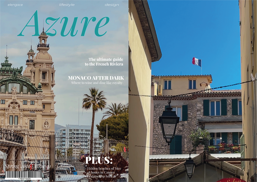
Front & Back Cover
- 3 days ago
- 2 min read
One of the hardest things I have encountered when choosing the photos was that they needed to be in some way similar to each other.
I chose this one for the front as I think it is very eye-catching and aesthetically pleasing. For this picture, I used the rule of thirds.
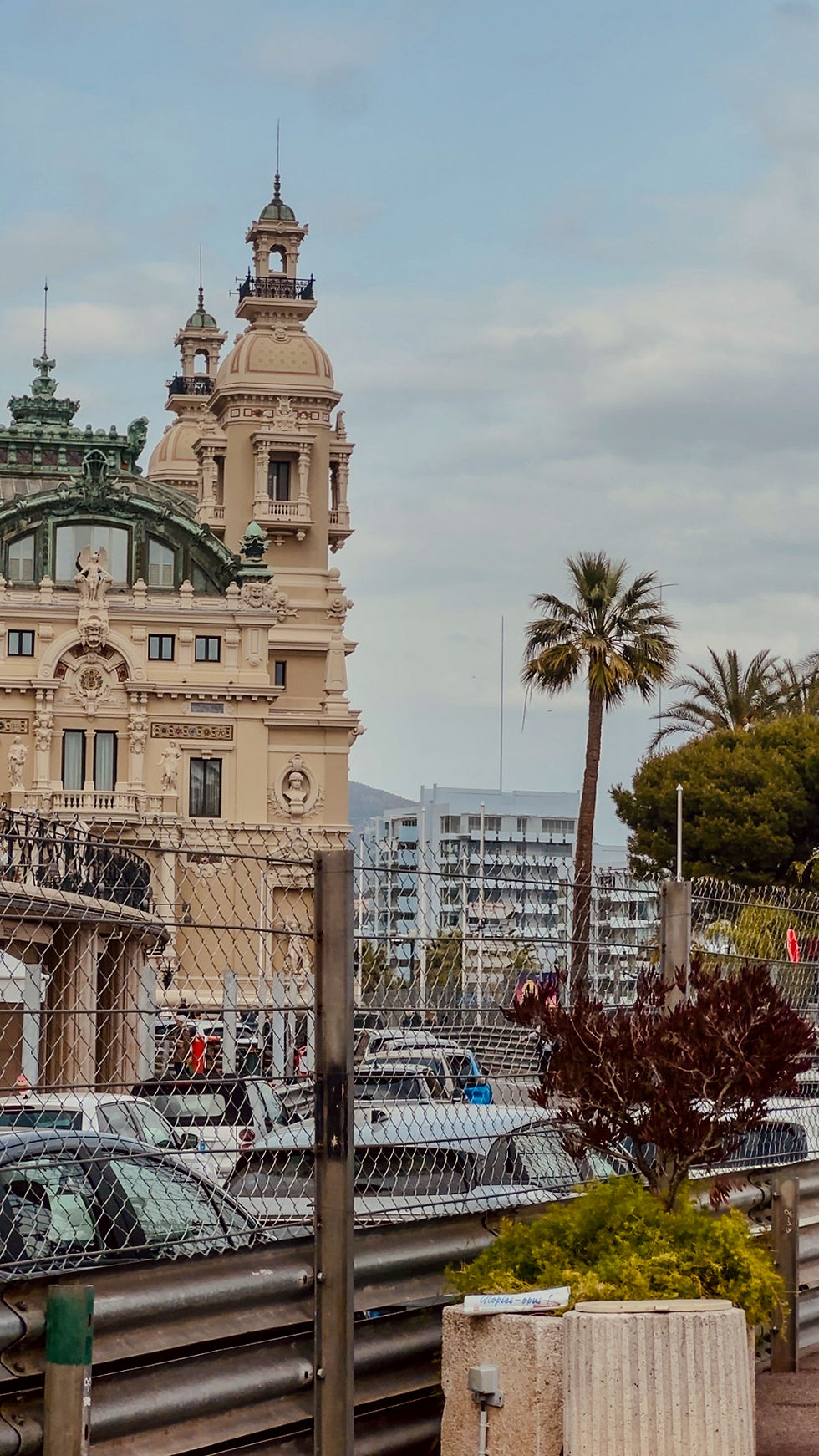
I have also used this photo, because it was taken in the most popular places of all, the Monte Carlo Casino.
Besides that, the fences that have been installed make the viewer want to know more, as they don't usually see fences this big in Monaco. The fences are put up one month before the F1 Grand Prix Races, but during the year, there are no fences.
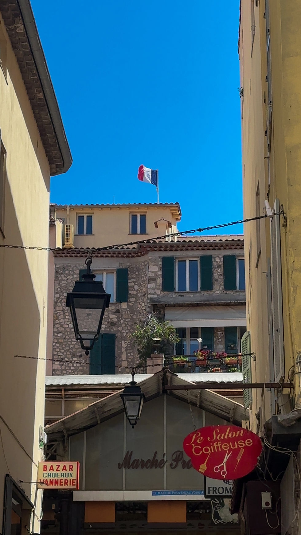
For the back cover I deliberately chose the narrow street view with the French flag and old lanterns. I wanted the back cover to feel more intimate and authentic than the front, showing the everyday charm of the Riviera rather than the grand monuments.
I created both covers using Adobe Illustrator and Photoshop. Illustrator was totally new to me, so it wasn’t easy at all. I had never used it before and I had to learn everything from scratch. It took me some time to figure out how to work with vectors and get the masthead looking clean, but I’m really happy with how it turned out. Photoshop, on the other hand, felt like home because I’ve been using it for the past 5 years.
Here are a few stages of my work:


This is the final result in PNG. I am very happy with the outcome. I like the fact that I was able to put the masthead behind the building. In order to do this, I had to export the photo from Illustrator, add it to Photoshop, and add the original photo behind, from which I extracted the tower part and added it over the text. I had to complicate the process because, in the end, I found out that Illustrator does not offer the ability to select and add that part over the text.

Comments