Contents Page
- 2 days ago
- 1 min read
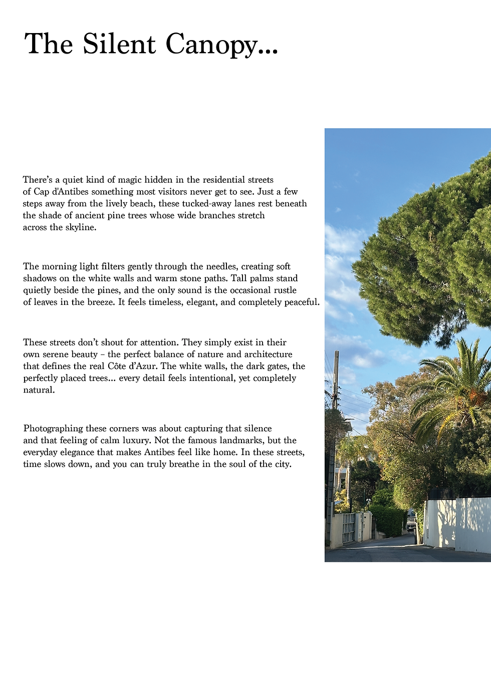
For the title page, I went with a minimalist picture of a tree with a strong contrast. I really like how I managed to blend the two pages using a black-and-white contrast.
On the right side, I kept everything super clean on a black background so the white text pops out nicely and feels elegant. One big photo on the left and all the contents on the right – makes it easy to read but still looks really stylish. I think this double-page spread captures exactly the sophisticated vibe I wanted for Azure.


Comments