Magazine Genre Research
- Apr 14
- 2 min read

When I started planning my AS Media Studies magazine, I knew I wanted it to feel like a luxury lifestyle publication inspired by the French Riviera. To get hold of exactly how such magazines work, I analysed three titles in the same genre: L’Officiel Riviera, Hello Monaco, and Condé Nast Traveller.
Hello Monaco follows a similar approach but feels slightly more journalistic. The masthead is clean and modern, the covers often show iconic Monaco locations with a model placed in the scene, and the layouts inside use large photographs mixed with text blocks. The fonts are a mix of serif for headlines and clean sans-serif for body
copy, and the overall design feels luxurious.
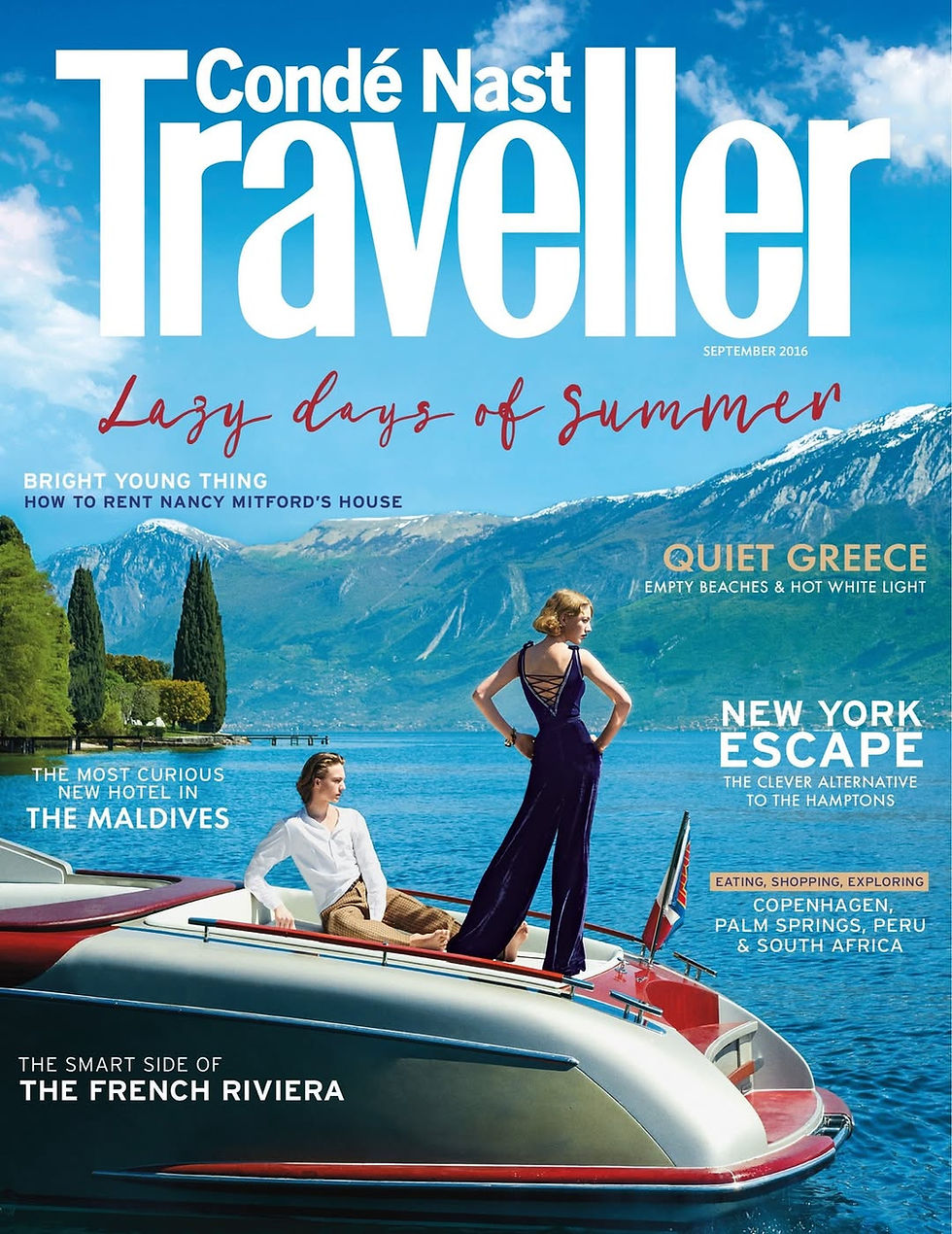
Condé Nast Traveller is the one I found most inspiring for my own vision. While it still uses models, it gives much more space to beautiful location photography – architecture, streets, harbours and aesthetic details. The layouts have more space, the typography is elegant but minimal, and the colour scheme is softer, focusing on the atmosphere of the place rather than the person.
L’Officiel Riviera has a very strong and consistent house style. The masthead is elegant and dominant, usually in gold or white serif font against a dark background. The colour palette, usually consisting of navy, gold, and black, is used throughout, creating a feeling of exclusive wealth.
In the example I attached, it focuses on portraying the views for the Maybourne Riviera, keeping a simplistic approach with a palette of white, blue, and their iconic image placement.

After studying these three magazines, I have come to the conclusion that even though they are excellent examples of luxury lifestyle media, I want to create something different for my magazine. I love the sophisticated codes and conventions they use, but I don't want to include any models or people on my pages. Instead, I want every photograph to focus purely on the buildings, streets, harbours, architecture, and aesthetic details of the Riviera. My magazine will challenge the convention of model-heavy pages by using only original location photography to construct a calm, immersive, and exclusive atmosphere. This way, the representation will be about the place itself and the feeling it conveys, not about fashion models. I will keep the elegant masthead, gold and navy colour scheme, and generous space, but I will make the visual identity centre entirely on the beauty of the locations.
Comments